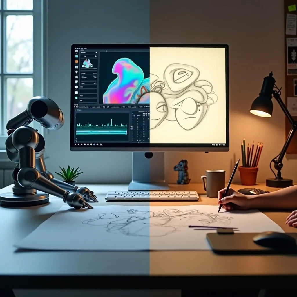
Role of Kinetic Typography in UI & UX
These days, when new and existing customers visit your website, they don’t want to see something plain and boring. Instead, they want it to be interactive and capture their visual interest. The best way to increase website engagement is by animating text elements and using motion. The art of bringing text to life is called kinetic typography.
It’s much more than choosing a font and selecting a size. It’s a creative art form that can completely change the way your website or app looks and feels. A lot of people don’t give enough importance to typography. However, the right typography can make all the difference. It also has an important role to play in UI and UX. Besides brand and business websites, kinetic typography is also used widely in music videos, movies and ad films. Think of it as a moving art form. Research suggests that typographic visuals are the best way to tell stories and evoke emotions in an audience.
What is Kinetic Typography?
Though kinetic typography is associated with movement, it’s much more than that. It can be used to highlight important sections, help users navigate through a website and gradually reveal information thereby holding onto their curiosity. Websites generally have long blocks of text which sometimes become difficult to consume at once. By using kinetic typography, the information becomes easily digestible and engaging. Anyone who has completed a certificate course in web designing is probably looking for ways to make a website dynamic and memorable. The way forward is incorporating a powerful web design strategy. It helps you stand out from your competition and capture user interest at the same time.
Only changing colour or font isn’t considered kinetic typography. For it to be considered kinetic, it has to be associated with movement. Fade-ins, fade-outs, contortions, 3D movements, flipping, morphing and fluidity constitute kinetic typography.
Why Should Web Designers Use Kinetic Typography?
We’ve already mentioned that typography is an important component of UI and UX design. Back in the day, only thoroughly experienced designers were using kinetic type. However, thanks to technological advancements, motion typography is now at everyone’s disposal. Incorporating this trend into your design strategy is powerful especially if you want to hold the audience’s attention for long.
If you’re kickstarting a career in web designing, here are a few reasons you should use kinetic typography:
Enhances legibility
Whether it’s a website or app, legibility is important. The text should be easy to read for a user. The components of well-designed typography include the right font, size, spacing and colour. When all these come together along with great animation, the readability of the text improves considerably and also enhances the overall user experience.
Responsiveness
Did you know? Typography can also improve the responsiveness of your visitors. The use of kinetic typography throughout your website changes the way it is perceived. It also helps you maintain consistent branding and increases the accessibility for all your users.
Grabs attention
When websites are heavily text-based, too much bandwidth is used. However, owing to technological advancements, the speed of broadband also improved. Gone are the days when websites are information dumps. Today, they are engrossing customer experiences. It’s true that movement draws our eyes. Thus, if you want to grab a user’s attention, kinetic type is the perfect way to do so.
Adds personality and sets the tone
Choosing the right typeface is important as it adds personality and character to your website or app. In order to evoke emotions and set the tone for your brand, using motion or animation is important. For example, if a user sees something floating in the air or moving in or out, it can leave a lasting impression on them. They’re more likely to remember the offerings of your brand even after leaving your website.
Supports hierarchy
Kinetic typography also supports visual hierarchy. When there’s too much information to consume on a particular website, using different animation helps the user understand what’s most important first. For example, for headings, you can use one type of animation and for body text another type. However, when you’re designing kinetic typographic compositions, maintaining consistency is important. You must also optimise the effect duration. It shouldn’t be too short nor too long.
Conclusion
Typography might seem like a small detail. However, it has a big role to play in elevating user experience. Web designers should use kinetic typography to highlight key messages. Language plays an important role in how we communicate. Think of kinetic typography as an aesthetic tool. It makes your message more interesting and engaging. Though it’s a simple and subtle implementation, it can make a message look inviting and captivating.
We at Vogue offer a six-month certificate course in web designing for those who want to learn the nitty-gritties of UI, UX and kinetic typography.